Layout:
Home > Scary Graphs Inside! Come look and turn your hair white!

Scary Graphs Inside! Come look and turn your hair white!

January 9th, 2007 at 07:41 pm

Source:

Text is Sudden Debt and Link is http://suddendebt.blogspot.com/2007/01/some-rather-unpleasant-charts-chart.html
Sudden Debt


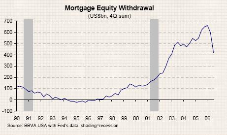
The next chart shows how much money was taken out during the housing bubble in the form of equity withdrawal (the Fed estimates that 2/3 of this money was consumed - not saved). The amount is now going down fast and the impact is being felt in the retail sector.

I excised some text blaming the spending on plasma TVs.

0 Responses to “Scary Graphs Inside! Come look and turn your hair white!”

Leave a Reply

(Note: If you were logged in, we could automatically fill in these fields for you.)
*
Will not be published.
   

* Please spell out the number 4.  [ Why? ]

vB Code: You can use these tags: [b] [i] [u] [url] [email]